 点赞(
点赞(在我们做网页的时候 总会遇到PC端样式跟移动端样式不同,有的PC设计好好的 但是在移动端却变样的 ,这个时候就需要 用以下代码来说明了
")
@media screen and (min-width:320px) and (max-width:359px){.post__description table {table-layout:fixed;} }
@media screen and (min-width:360px) and (max-width:409px){.post__description table {table-layout:fixed;} }
@media screen and (min-width:410px) and (max-width:639px){.post__description table {table-layout:fixed;}}
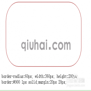
以上代码说明是 在320px到359 范围为一个样式 的格式说明
未经允许不得转载! 作者:小秋同学,转载或复制请以超链接形式并注明出处XQ 筑站派。
原文地址:《网页排版响应式在指定尺寸下为指定样式说明CSS》发布于:2020-08-14 08:53:58